Lettering for Disney’s Glendale Airport restoration
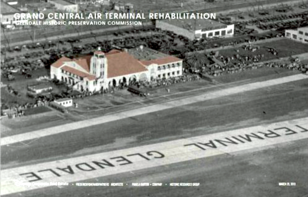
When Disney bought the long defunct, delapidated and boarded up Glendale Central Air Terminal to expand their campus, the city of Glendale asked that they restore the historic airport terminal building. Established in 1922 as the Glendale Municipal Airport, it served as the first commercial airport in the Los Angeles area. Howard Hughes, Amelia Earhart and Charles Lindbergh all used Glendale as their home airport or did significant work there. It was also used for filming where Shirley Temple, James Cagney, Ronald Reagan and even Pee Wee Herman had big adventures.
Restoration included signage on three faces of the building and Mick Hodgson of PhD A Design Office asked me to recreate the lettering. Most of the old photographs weren’t very clear so in some cases it became a process of creating the letters, sometimes drawing over blurry enlargements and sometimes not. It was a wonderful and unique experience and the results are very successful. I was glad to be a small part of the rehabilitation.
The restoration was finished in 2016 and tours are available by appointment.
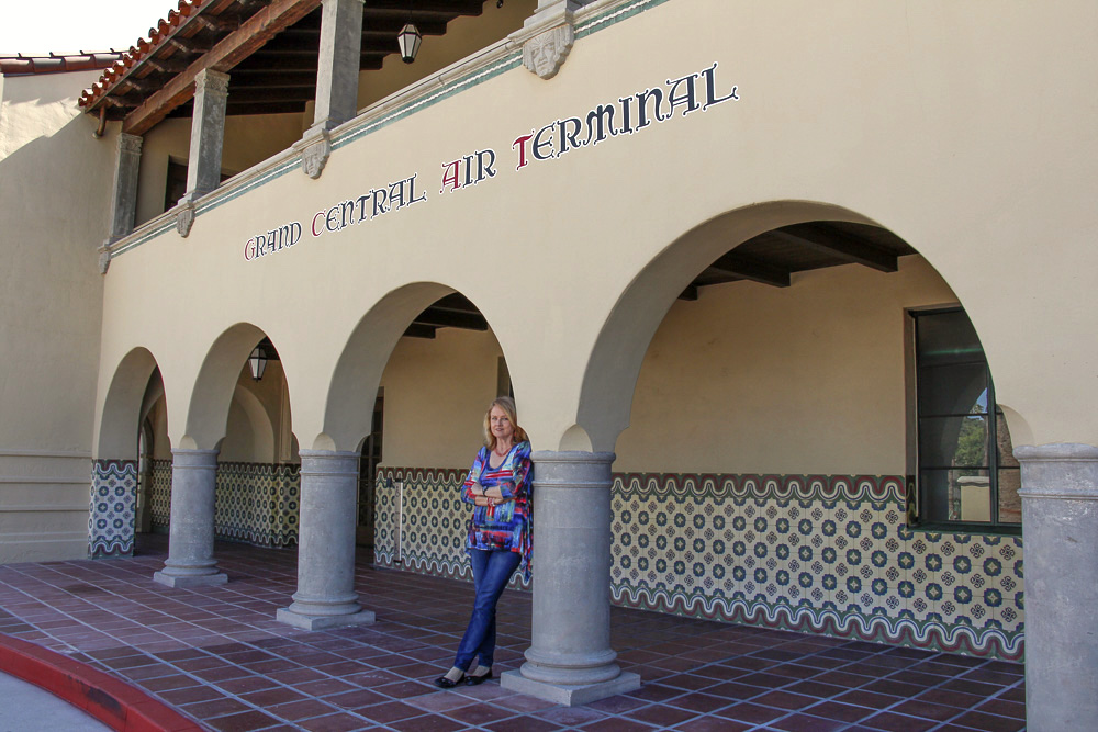
Versals on the south and west facades
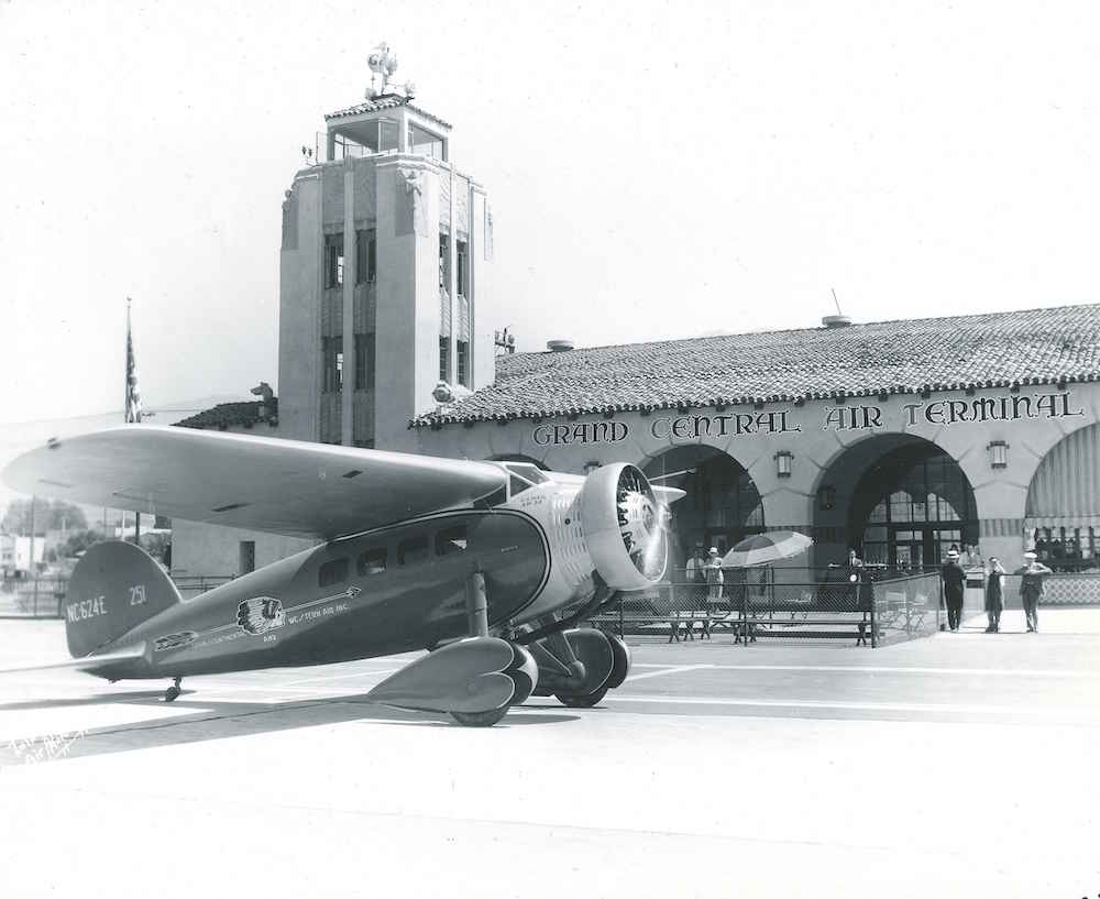
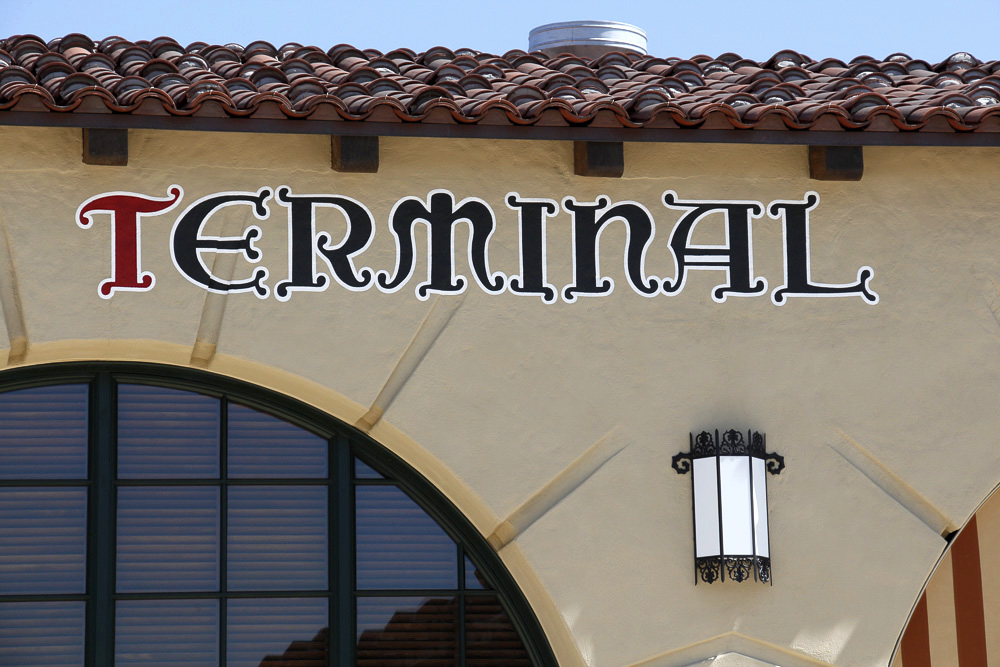
Some signpainter in the 1930’s had a lot of fun with the lettering painted on this building. Remember ArtDeco was popular. Saving the stylistic quirkiness was a big part of the goal of recreating the look of the original lettering.
Above: original building with it’s versal letters, outlined in white. There were very clear photos of the lettering on this facade. Below: the repainted lettering. What a capital M!
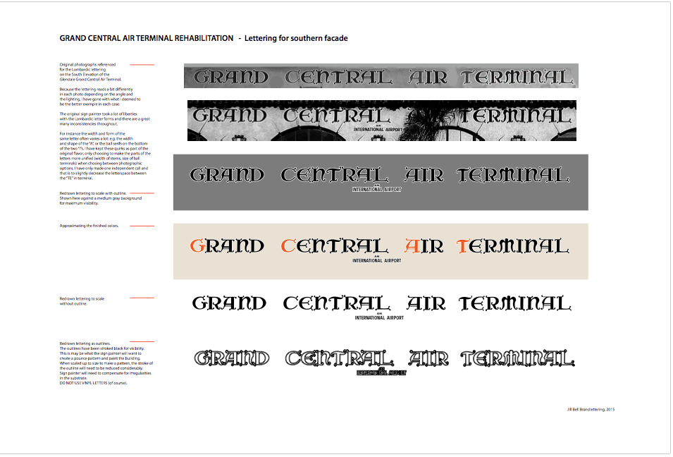
Below: Work in progress on the versal letters. Showing the original lettering from the better photos, the drawn letters, drawn and outlined, colored letters etc. side by side.

Architects’ rendering of the south restoration
Romans on the North facade
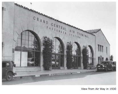
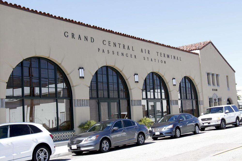
Above: The north facade of the building as it appeared in 1931. Below: how it looks today with the letters I recreated in place. There were no clear or close up photos of these letters so there was some latitude for interpretation of the Romans. They were extruded (made 3D) in manufacturing and attached to the wall.
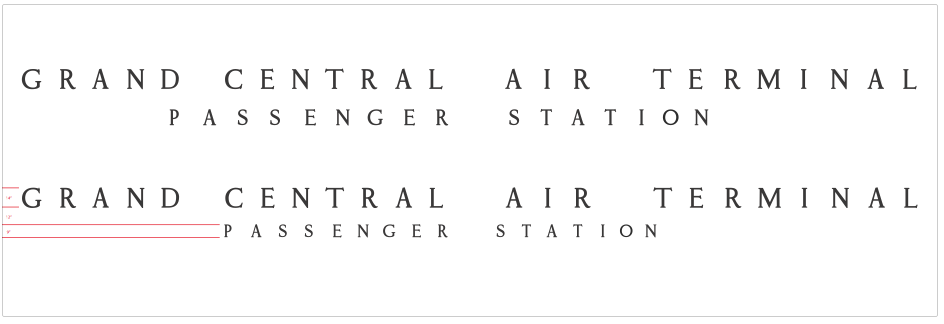
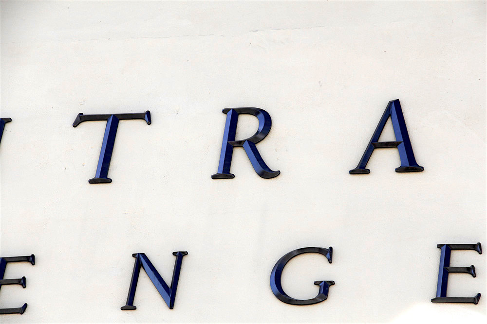
Above: one of the many rounds of adjustments, this one after the lettering style was established, exploring spacing and scale options. Below: a close up of the final, lovely 3D letters on the building.
West Facade
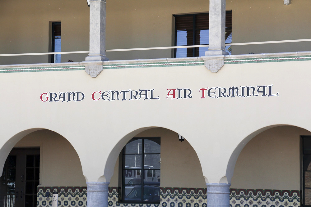
Below: The same versal lettering created for the south face of the building was used on this, the west facade bit on a much smaller size.
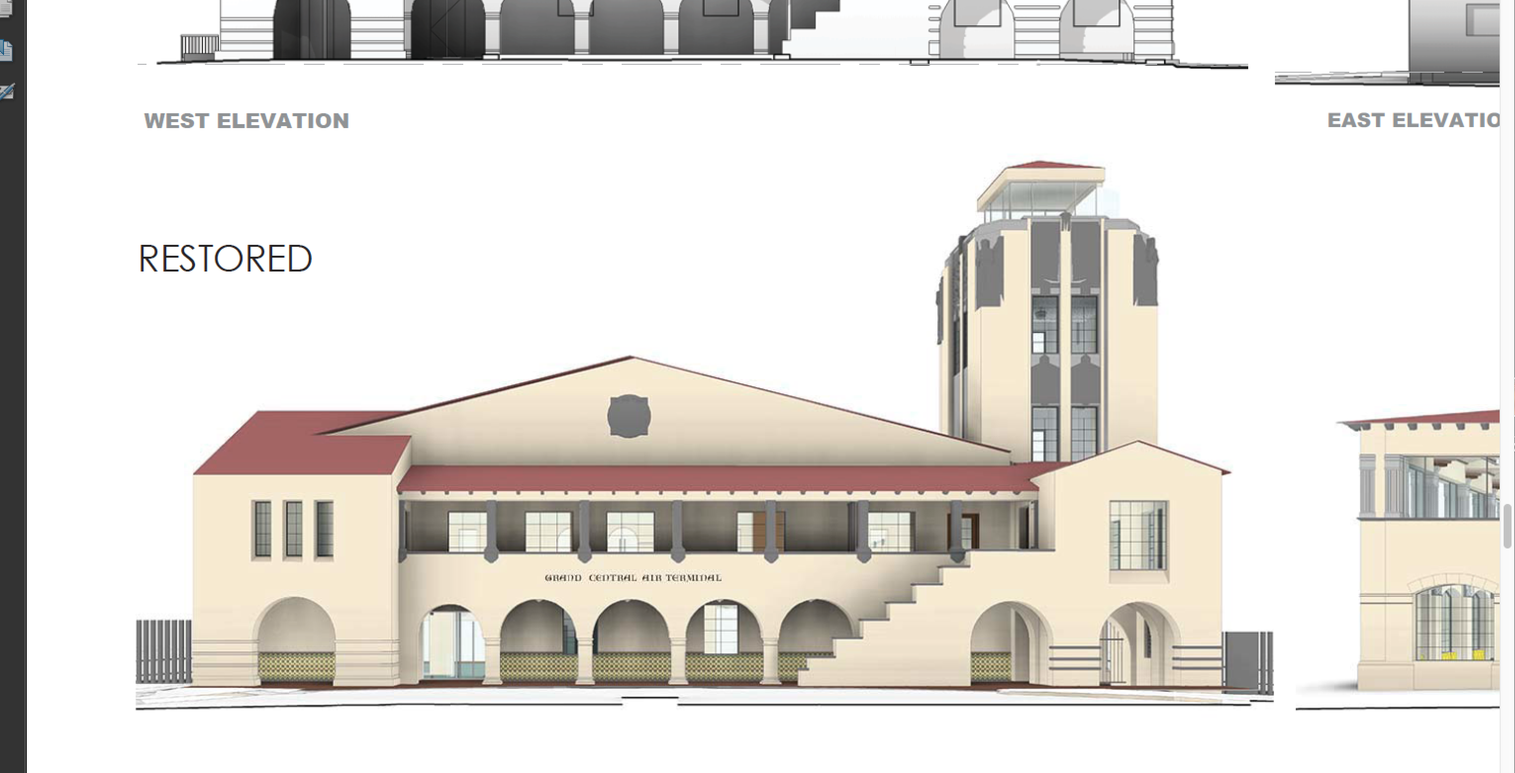
Architects’ rendering of the west restoration
